WUNRN
http://www.genderatwork.org/Portals/0/Uploads/Documents/M&E%20Graphic%20Final2%20(1).pdf
EFFECTIVENESS OF GRAPHIC TO ILLUSTRATE GENDER EQUALITY –
MEASURING, UNDERSTANDING, & COMMUNICATING THE PROCESSES OF SOCIAL CHANGE IN
GENDER EQUALITY
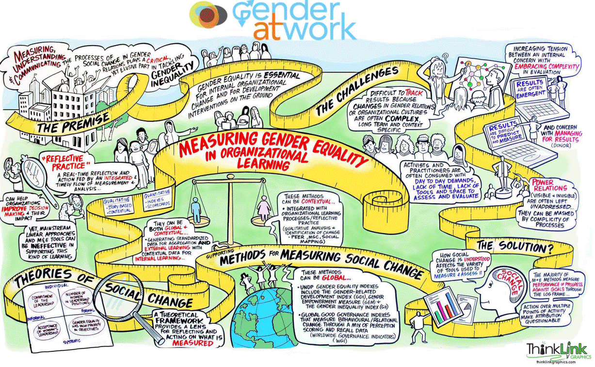
This graphic was
designed by Liisa Sorsa of thinklinkgraphics to illustrate the key points that G@W Associate
Jeremy Holland made in a densely written research paper on measuring
gender equality. Graphic recording is visual thinking. Since most of us process
information visually, giving visual form to papers, presentations, and workshop
proceedings increases clarity of ideas, deepens engagement, and inspires
linking of disparate ideas. When people see their words take visual shape they
feel heard and validated. A number of years ago, while facilitating a workshop
in Jerusalem with Palestinians and Israelis on ending religiously motivated
violence, we decided to have a colleague visually record the proceedings. As
the graphic took shape, the tension in the room subsided as conflicting ideas
came together side by side to make a whole. The arguing between Israelis and
Palestinians subsided and they used their energy to engage with the ideas they
generated which were on a twenty foot banner in front of them.
The graphic
above performed magic. Just to give you a background, this was part of a
Measuring Gender Equality Initiative launched in collaboration with the
Participation, Power and Social Change (PPSC) Team in the Institute of
Development Studies at the University of
Sussex, and funded by NORAD, the Global Fund for
Women and UN Women.
It took place in May 2011 and brought together 26 participants from 12
countries. These participants represented organizations working at all levels
of international cooperation for social change from women’s organizations,
university settings and donor agencies. At the heart of the initiative was a
desire to initiate a ‘community of learning’ by bringing together donors and
activists at all levels of the system.
Jeremy Holland presented the prepared background paper
Measuring Gender Equality in Organisational Learning: A Background Paper
(Holland and Sheppard, Gender at Work, 2011), underscoring how measuring,
understanding and communicating social change in gender relations plays a
critical yet elusive part in tackling gender equality.
A better understanding
of the processes at play is essential for both internal organizational change
and for development interventions through reflective practice. The issue
remains that traditional linear tools for M&E are ineffective on their own
in supporting this type of organizational learning as tracking changes in
gender relations and/or organizational cultures are complex, long-term, and
context specific. Too often there is a mismatch between donors managing for
results, the evaluation community’s concern for complexity, and activists and
practitioners who are busy with day-to-day activities.
Holland emphasized that
how change is conceptualized affects how it is measured, therefore, it is
important to start with a strong theoretical basis and then use appropriate
methods to test the theory.
For organizations to
use evidence about what works best for gender equality, they need to be able to
reflect on power relations (both the incentives and vested interests) that
shape and maintain the status quo. Some of the methods outlined in the paper
are participatory instruments which quantify relational change through
scorecards—tools which are at their best when they integrate description of change
with qualitative explanation of change.
Liisa and I worked with
the paper to translate the academic prose into everyday language, checking back
with Jeremy to ensure we got it right. We identified the key themes—the bold
ideas on the measuring tape, then Liisa had at it. When she finished, we sent a
draft to Jeremy—who accepted it as created. When she and I went over it in
detail, we found a few more things to change; and when we got to the UK, where
the workshop was begin held, Jeremy saw the large poster for the first time in
its grandness. He did request a few minor changes, which we made later to the
graphic and the image you see here is the final graphic.
The key idea with
graphic recording is something we all know: most of us are visually oriented,
yet we try to learn or present our concepts through speaking (usually one way)
or through bullet points, which miss the whole, and fragment any sense of
larger meaning. Graphics put the ideas in simple pictures and words. Instead of
attaching ideas to a person and interpreting the ideas based on your notions of
the person, the graphic becomes objective material that people discuss and
challenge in productive conversations. It’s a great way to summarize research
and capture ideas from meetings so that everyone sees the whole, rather than
relying on the slipperiness of bullet points and memory.